页面外观
卡片圆角
assets/scss/custom/_base.scss 中的 CSS 变量控制卡片圆角、区块间距、字号和颜色:
 1
 2
 3
 4
 5
 6
 7
 8
 9
10
11
12
13
14
| :root {
--main-top-padding: 30px;
--card-border-radius: 25px;
--tag-border-radius: 8px;
--section-separation: 40px;
--article-font-size: 1.8rem;
--code-background-color: #f8f8f8;
--code-text-color: #e96900;
&[data-scheme="dark"] {
--code-background-color: #ff6d1b17;
--code-text-color: #e96900;
}
}
|
--card-border-radius 决定卡片圆角,--section-separation 决定页面区块之间的距离。这两个变量会同时影响全站的卡片布局。
行内代码的前景色与背景色也在这组变量中设置。亮色和暗色模式分别使用独立配色,避免行内代码与正文混在一起或过分抢眼。
友链与归档
首页、友链与归档页的卡片样式位于 assets/scss/custom/_base.scss。
桌面端的紧凑文章列表使用两列布局:
 1
 2
 3
 4
 5
 6
 7
 8
 9
10
11
12
13
14
15
16
17
18
| @media (min-width: 1024px) {
.article-list--compact {
display: grid;
grid-template-columns: 1fr 1fr;
background: none;
box-shadow: none;
gap: 1rem;
article {
background: var(--card-background);
border: none;
box-shadow: var(--shadow-l2);
margin-bottom: 8px;
margin-right: 8px;
border-radius: 16px;
}
}
}
|
.article-list--compact 在桌面端使用两列网格,归档、友链和链接页面共用这套 compact 列表结构。外层容器不保留背景和阴影,每个 article 单独使用卡片样式,避免出现大卡片包住多个小卡片的层级。
封面与分类页
文章封面高度由 assets/scss/custom/_layout.scss 控制:
 1
 2
 3
 4
 5
 6
 7
 8
 9
10
11
12
13
| .article-list article .article-image img {
width: 100%;
height: 150px;
object-fit: cover;
@include respond(md) {
height: 200px;
}
@include respond(xl) {
height: 305px;
}
}
|
object-fit: cover 保持封面比例,卡片高度随屏幕尺寸逐步增加。
分类页顶部的 .section-card 显示分类封面、文章数量、分类名和描述。手机端使用上下结构并将图片固定为 16:9,桌面端恢复左右结构:
相关样式位于 assets/scss/custom/_archives-home.scss:
 1
 2
 3
 4
 5
 6
 7
 8
 9
10
11
12
13
14
15
16
17
18
19
20
21
22
23
24
25
26
27
28
29
30
31
32
33
34
35
36
37
38
39
40
41
42
43
44
45
46
47
48
49
50
51
52
53
54
55
56
57
58
| .section-card {
align-items: stretch;
flex-direction: column;
gap: 0;
overflow: hidden;
padding: 0;
.section-image {
width: 100%;
aspect-ratio: 16 / 9;
overflow: hidden;
img {
display: block;
width: 100% !important;
height: 100% !important;
object-fit: cover !important;
}
}
.section-details {
min-width: 0;
border-left: 0;
border-top: 1px solid rgba(255, 255, 255, .18);
padding: 18px 20px 20px;
}
.section-count,
.section-term,
.section-description {
word-break: break-word;
}
@include respond(md) {
align-items: center;
flex-direction: row;
gap: 20px;
padding: var(--small-card-padding);
.section-image {
flex: 0 0 58%;
max-width: 58%;
}
.section-details {
border-top: 0;
border-left: 5px solid rgba(255, 255, 255, .85);
padding: 0 0 0 15px;
}
}
@include respond(xl) {
.section-image {
flex-basis: 62%;
max-width: 62%;
}
}
}
|
.subsection-list 中的子分类横卡使用响应式网格:手机端一列,平板以上两列,宽屏三列。相关代码同样位于 assets/scss/custom/_archives-home.scss:
 1
 2
 3
 4
 5
 6
 7
 8
 9
10
11
12
13
14
15
16
17
18
19
20
21
22
23
24
25
26
27
28
29
30
31
32
33
| .subsection-list {
overflow-x: visible;
.article-list--tile {
display: grid;
grid-template-columns: 1fr;
gap: 18px;
overflow: visible;
article {
width: 100%;
height: auto;
aspect-ratio: 16 / 9;
margin-right: 0;
}
}
@include respond(md) {
.article-list--tile {
grid-template-columns: repeat(2, minmax(0, 1fr));
article {
aspect-ratio: 5 / 3;
}
}
}
@include respond(xl) {
.article-list--tile {
grid-template-columns: repeat(3, minmax(0, 1fr));
}
}
}
|
普通文章列表按高度控制封面,分类头图使用 16:9,子分类横卡在手机端优先显示完整横图,桌面端使用多列提高信息密度。
悬浮反馈
卡片悬浮样式位于 assets/scss/custom/_archives-home.scss:
1
2
3
4
5
6
7
| .article-list article {
transition: transform 0.6s ease;
}
.article-list article:hover {
transform: scale(1.05);
}
|
归档页的 tile 卡片与 compact 卡片分别使用轻微缩放和右移动画,模板结构不需要改动。
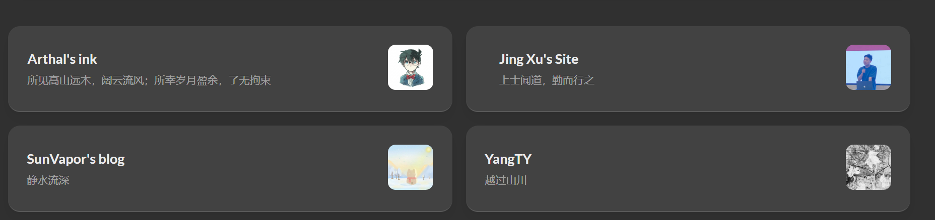
三栏布局
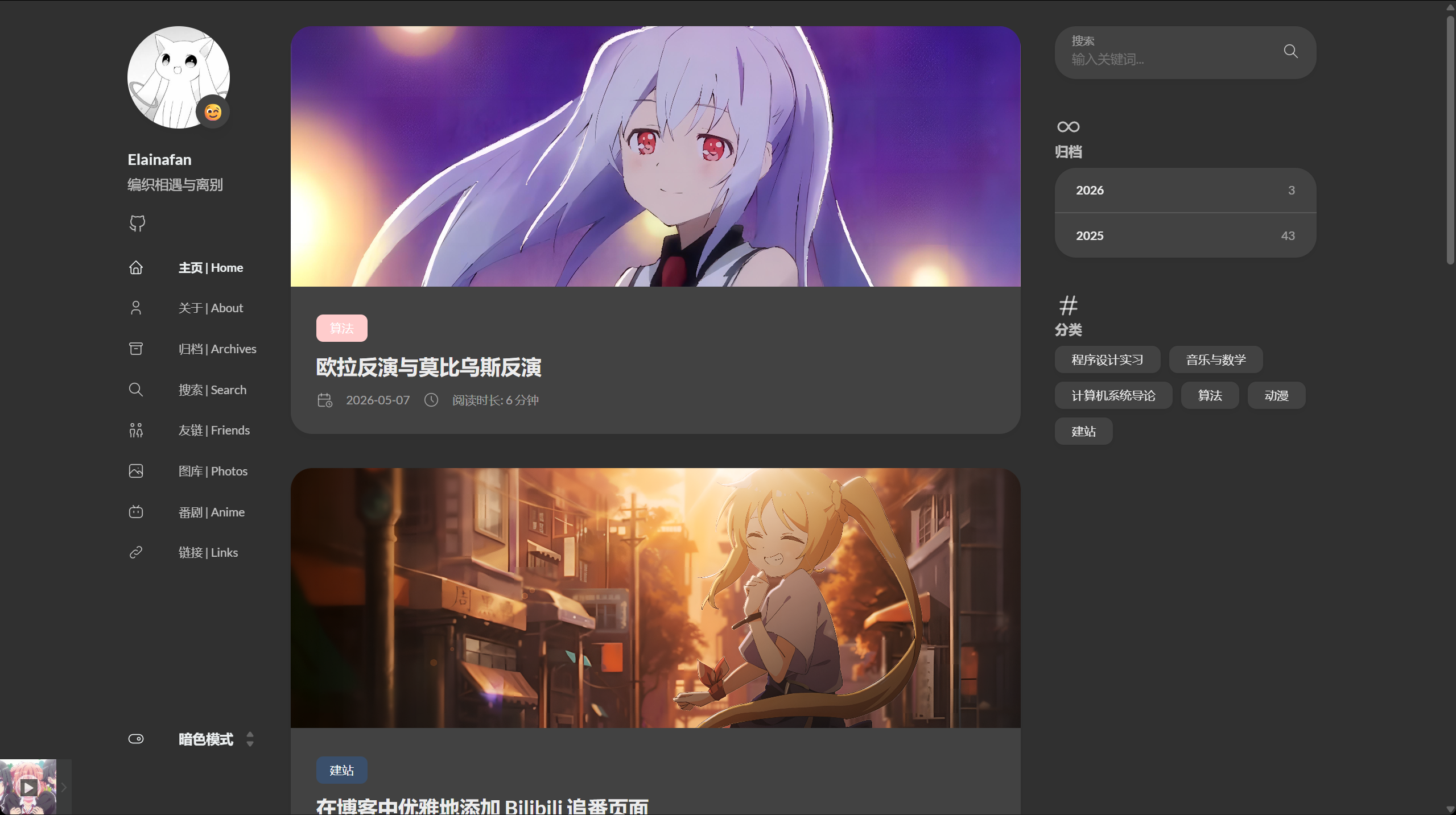
三栏宽度由 assets/scss/custom/_layout.scss 控制。.container.main-container 包含左侧栏、右侧栏与正文区域。
布局参数如下:
 1
 2
 3
 4
 5
 6
 7
 8
 9
10
11
12
13
14
15
16
17
18
19
20
21
| .container {
&.extended {
@include respond(md) {
max-width: 1024px;
--left-sidebar-max-width: 25%;
--right-sidebar-max-width: 22% !important;
}
@include respond(lg) {
max-width: 1280px;
--left-sidebar-max-width: 20%;
--right-sidebar-max-width: 30%;
}
@include respond(xl) {
max-width: 1453px;
--left-sidebar-max-width: 15%;
--right-sidebar-max-width: 25%;
}
}
}
|
整体容器在宽屏下适当放宽,并重新分配左右侧栏宽度,为代码块、公式与表格留出正文空间。
菜单
菜单的圆角与阴影位于 assets/scss/custom/_layout.scss:
1
2
3
4
5
6
| .menu {
background-color: var(--card-background);
box-shadow: var(--shadow-l2);
border-radius: 10px;
padding: 30px 30px;
}
|
移动端菜单使用独立卡片背景,桌面端恢复透明背景与常规布局。
背景图
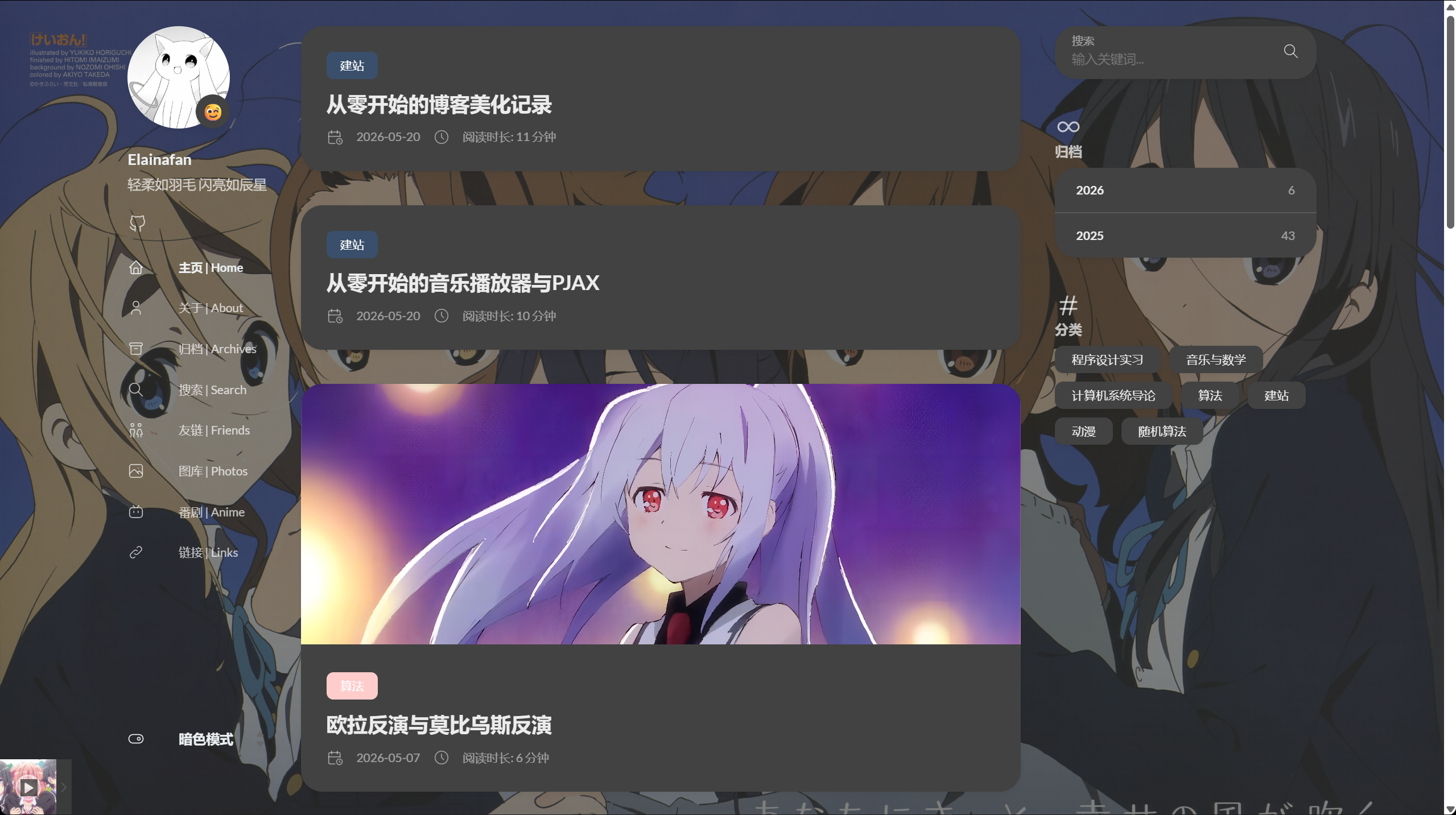
背景图通过 Hugo 资源读取并设置到 body,实现参考了 Hugo Stack 主题装修笔记
。模板读取 assets/background/ 中的第一张图片,不写死文件名;替换该目录中的资源即可更换背景。
layouts/partials/footer/custom.html 中写入:
 1
 2
 3
 4
 5
 6
 7
 8
 9
10
11
12
13
14
15
16
17
18
19
20
21
22
| {{ $backgroundImages := resources.Match "background/*.{jpg,jpeg,png,webp,avif}" }}
{{ with $backgroundImages }}
{{ with index . 0 }}
<style>
body {
background:
linear-gradient(rgba(245, 245, 250, 0.72), rgba(245, 245, 250, 0.72)),
url({{ .Permalink }}) no-repeat center top;
background-size: cover;
background-attachment: fixed;
}
[data-scheme="dark"] body {
background:
linear-gradient(rgba(48, 48, 48, 0.62), rgba(48, 48, 48, 0.62)),
url({{ .Permalink }}) no-repeat center top;
background-size: cover;
background-attachment: fixed;
}
</style>
{{ end }}
{{ end }}
|
background-size: cover 让背景铺满屏幕,background-attachment: fixed 在滚动时固定背景。linear-gradient 作为遮罩:亮色模式使用偏白遮罩,暗色模式使用偏黑遮罩。正文仍由卡片背景承载,图片主要出现在页面两侧与卡片空隙中。
头像
头像旋转样式位于 assets/scss/custom/_base.scss:
1
2
3
4
5
6
7
| .sidebar header .site-avatar .site-logo {
transition: transform 1.65s ease-in-out;
}
.sidebar header .site-avatar .site-logo:hover {
transform: rotate(360deg);
}
|
正文图片
正文图片的圆角样式同样位于 assets/scss/custom/_base.scss:
1
2
3
4
5
6
7
| .article-page .main-article .article-content {
img {
max-width: 96% !important;
height: auto !important;
border-radius: 8px;
}
}
|
max-width: 96% 在图片与正文边缘之间留出空隙,圆角和阴影不会贴住卡片边界。
图片预览
Markdown 图片可能来自 Page Bundle,也可能来自 static。content/post/某篇文章/1.png 可以通过 .Page.Resources.GetMatch 取得宽高; 则直接指向 static/images/anime-diary/4.png。layouts/_default/_markup/render-image.html 会把这两类本地位图都纳入 PhotoSwipe,外链、协议相对地址与 SVG 保持普通图片行为。
静态本地图的判断如下:
1
2
3
4
| {{- $notSVG := ne (lower (path.Ext .Destination)) ".svg" -}}
{{- $isExternal := or (strings.HasPrefix .Destination "http://") (strings.HasPrefix .Destination "https://") -}}
{{- $isProtocolRelative := strings.HasPrefix .Destination "//" -}}
{{- $isStaticImage := and (strings.HasPrefix .Destination "/") (not $isExternal) (not $isProtocolRelative) $notSVG -}}
|
Page Bundle 资源直接读取 Hugo 提供的尺寸,静态本地图则补上 gallery-image:
 1
 2
 3
 4
 5
 6
 7
 8
 9
10
11
| {{- if $image -}}
{{- $Permalink = $image.RelPermalink -}}
{{- if $notSVG -}}
{{- $Width = $image.Width -}}
{{- $Height = $image.Height -}}
{{- $galleryImage = true -}}
{{- end -}}
{{- else if $isStaticImage -}}
{{- $galleryImage = true -}}
{{- end -}}
|
static 图片没有 Hugo 生成的 width 与 height。assets/ts/gallery.ts 依次读取标签尺寸、naturalWidth / naturalHeight 和当前布局尺寸,并在都不可用时使用兜底值:
 1
 2
 3
 4
 5
 6
 7
 8
 9
10
| private static imageDimensions(img: HTMLImageElement) {
const width = parseInt(img.getAttribute('width') || ''),
height = parseInt(img.getAttribute('height') || ''),
rect = img.getBoundingClientRect();
return {
w: width || img.naturalWidth || Math.round(rect.width) || 1200,
h: height || img.naturalHeight || Math.round(rect.height) || 675
};
}
|
点击图片时再根据当前节点刷新尺寸与原图地址:
1
2
3
4
5
6
7
8
9
| const img = item.el.querySelector('img');
if (img) {
const dimensions = StackGallery.imageDimensions(img);
const link = item.el.querySelector('a');
item.w = dimensions.w;
item.h = dimensions.h;
item.src = link?.href || img.src;
item.msrc = img.getAttribute('data-thumb') || img.src;
}
|
PJAX 只替换 .main-container、.js-Pjax 与 .Timer,PhotoSwipe 的根节点和脚本因此放在全站 footer 中常驻。layouts/partials/footer/include.html 包含:
1
2
3
4
| {{ partialCached "footer/components/script.html" . }}
{{ partialCached "footer/components/custom-font.html" . }}
{{ partialCached "article/components/photoswipe" . }}
{{ partial "footer/custom.html" . }}
|
PhotoSwipe 只由全站 footer 插入,页面中始终只有一份 .pswp。直接打开文章或通过 PJAX 进入文章时,window.Stack.init() 都会重新扫描 .article-content 并绑定图片预览。
更新时间
需要持续维护的文章在 frontmatter 中使用 updates,最新记录放在第一项:
1
2
3
| updates:
- date: 2026-07-16
content: 校正文档中的模板路径与当前实现。
|
文章正文不渲染更新明细,文章卡片只读取第一项并显示最近更新时间。首页的 layouts/partials/article-list/default.html 使用:
 1
 2
 3
 4
 5
 6
 7
 8
 9
10
| {{ with .Params.updates }}
{{ with index . 0 }}
<div class="article-time--updated">
{{ partial "helper/icon" "infinity" }}
<time datetime="{{ time.Format "2006-01-02" (time .date) }}">
更新 {{ time.Format "2006-01-02" (time .date) }}
</time>
</div>
{{ end }}
{{ end }}
|
卡片同时保留发布日期与“更新 YYYY-MM-DD”,更新说明只存在于 frontmatter 中。
样式文件
通用样式按功能拆成多个 partial,再由 assets/scss/custom.scss 统一引入:
1
2
3
4
5
6
7
8
| @import "music-player.scss";
@import "custom/base";
@import "custom/layout";
@import "custom/archives-home";
@import "custom/code";
@import "custom/article-extras";
@import "custom/friend-circle";
|
具体规则分别位于 assets/scss/custom/_base.scss、_layout.scss、_code.scss 与 _friend-circle.scss 等 partial,按全局基础样式、布局、代码块、文章增强和友链朋友圈分开维护。
正文阅读
引用与长链接
引用块样式位于 assets/scss/custom/_base.scss:
1
2
3
4
5
6
| .article-content {
blockquote {
border-left: 6px solid #358b9a1f !important;
background: #3a97431f;
}
}
|
引用块增加浅色背景,与正文保持清楚的层级。
长链接与行内代码也在 assets/scss/custom/_base.scss 中设置换行:
1
2
3
4
5
6
7
| a {
word-break: break-all;
}
code {
word-break: break-all;
}
|
建站教程和 Lab 笔记中的长 URL、路径与命令会在移动端正常换行,避免撑破正文宽度。
代码块
代码块基础样式位于 assets/scss/custom/_base.scss,.highlight 设置如下:
 1
 2
 3
 4
 5
 6
 7
 8
 9
10
| .highlight {
max-width: 102% !important;
background-color: var(--pre-background-color);
padding: var(--card-padding);
position: relative;
border-radius: 20px;
margin-left: -7px !important;
margin-right: -12px;
box-shadow: var(--shadow-l1) !important;
}
|
宽度、圆角、阴影与左右边距让代码块略宽于普通段落。
亮色模式使用单独配色:
1
2
3
4
5
6
7
8
| [data-scheme="light"] .article-content .highlight {
background-color: #fff9f3;
}
[data-scheme="light"] .chroma {
color: #ff6f00;
background-color: #fff9f3cc;
}
|
偏暖的代码背景与正文卡片保持区分。
macOS 顶栏
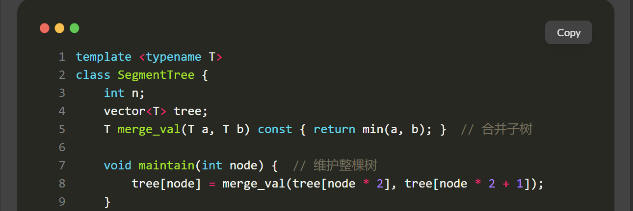
拟 macOS 顶栏位于 assets/scss/custom/_code.scss:
 1
 2
 3
 4
 5
 6
 7
 8
 9
10
11
12
13
| .article-content {
.highlight:before {
content: '';
display: block;
background: url(/code-header.svg);
height: 32px;
width: 100%;
background-size: 57px;
background-repeat: no-repeat;
margin-bottom: 5px;
background-position: -1px 2px;
}
}
|
顶栏图标位于 static/code-header.svg。Hugo 会把 static 中的文件复制到站点根目录,因此 CSS 可以直接使用 url(/code-header.svg)。
复制按钮
assets/ts/main.ts 为每个代码块动态追加复制按钮:
 1
 2
 3
 4
 5
 6
 7
 8
 9
10
11
12
13
14
15
16
17
18
19
20
21
22
23
| const highlights = document.querySelectorAll('.article-content div.highlight');
const copyText = `Copy`,
copiedText = `Copied!`;
highlights.forEach(highlight => {
const copyButton = document.createElement('button');
copyButton.innerHTML = copyText;
copyButton.classList.add('copyCodeButton');
highlight.appendChild(copyButton);
const codeBlock = highlight.querySelector('code[data-lang]');
if (!codeBlock) return;
copyButton.addEventListener('click', () => {
navigator.clipboard.writeText(codeBlock.textContent)
.then(() => {
copyButton.textContent = copiedText;
setTimeout(() => {
copyButton.textContent = copyText;
}, 1000);
});
});
});
|
页面初始化时扫描代码块并插入按钮,点击后把代码写入剪贴板。.highlight:hover .copyCodeButton 控制按钮的显示与隐藏。
长代码块
超过 80 行的代码块默认折叠,完整源码仍保留在页面中。
复制按钮与折叠逻辑集中在 assets/ts/main.ts 的 setupCodeBlocks()。每个代码块初始化后写入 data-enhanced,避免 PJAX 切页时重复插入控件:
 1
 2
 3
 4
 5
 6
 7
 8
 9
10
11
12
13
14
15
16
17
18
| const LONG_CODE_LINE_THRESHOLD = 80;
function setupCodeBlocks() {
const highlights = document.querySelectorAll('.article-content div.highlight') as NodeListOf<HTMLElement>;
highlights.forEach(highlight => {
if (highlight.dataset.enhanced === 'true') return;
highlight.dataset.enhanced = 'true';
const codeBlock = highlight.querySelector('code[data-lang]') as HTMLElement;
if (!codeBlock) return;
const lineCount = highlight.querySelectorAll('.lnt').length || (codeBlock.textContent || '').split('\n').length;
if (lineCount <= LONG_CODE_LINE_THRESHOLD) return;
highlight.classList.add('is-collapsible', 'is-collapsed');
});
}
|
行数优先从 Chroma 生成的 .lnt 统计;没有行号时按换行符计算。超过 80 行的代码块默认折叠,并在底部加入按钮:
 1
 2
 3
 4
 5
 6
 7
 8
 9
10
| const expandButton = document.createElement('button');
expandButton.type = 'button';
expandButton.className = 'codeFoldButton';
expandButton.textContent = `展开完整代码(${lineCount} 行)`;
highlight.appendChild(expandButton);
expandButton.addEventListener('click', () => {
const collapsed = highlight.classList.toggle('is-collapsed');
expandButton.textContent = collapsed ? `展开完整代码(${lineCount} 行)` : '收起代码';
});
|
折叠状态使用最大高度与底部渐变遮罩,样式位于 assets/scss/custom/_code.scss:
 1
 2
 3
 4
 5
 6
 7
 8
 9
10
11
12
13
14
15
16
| .article-content {
.highlight.is-collapsed {
max-height: 520px;
}
.highlight.is-collapsed::after {
content: '';
position: absolute;
right: 0;
bottom: 0;
left: 0;
height: 120px;
pointer-events: none;
background: linear-gradient(180deg, rgba(0, 0, 0, 0), var(--card-background) 72%);
}
}
|
短代码块保持完整显示,长代码块先露出开头,点击按钮后展开全部内容。
阅读进度
assets/ts/main.ts 在文章页动态创建阅读进度条:
 1
 2
 3
 4
 5
 6
 7
 8
 9
10
11
12
13
14
15
16
17
| function setupReadingProgress() {
const existing = document.querySelector('.reading-progress') as HTMLElement;
const article = document.querySelector('.article-page .main-article') as HTMLElement;
const content = document.querySelector('.article-content') as HTMLElement;
if (!article || !content) {
existing?.remove();
window.removeEventListener('scroll', updateReadingProgress);
window.removeEventListener('resize', updateReadingProgress);
return;
}
const bar = existing || document.createElement('div');
bar.className = 'reading-progress';
bar.setAttribute('aria-hidden', 'true');
if (!existing) document.body.appendChild(bar);
}
|
通过 PJAX 离开文章页时,脚本会移除进度条并解绑滚动监听,避免它残留在首页或搜索页。
阅读进度根据 .article-content 的位置与高度计算:
 1
 2
 3
 4
 5
 6
 7
 8
 9
10
11
12
13
| function updateReadingProgress() {
const bar = document.querySelector('.reading-progress') as HTMLElement;
const content = document.querySelector('.article-content') as HTMLElement;
if (!bar || !content) return;
const rect = content.getBoundingClientRect();
const scrollTop = window.scrollY || document.documentElement.scrollTop;
const start = scrollTop + rect.top;
const total = Math.max(content.scrollHeight - window.innerHeight * 0.55, 1);
const current = Math.min(Math.max(scrollTop - start, 0), total);
bar.style.transform = `scaleX(${current / total})`;
}
|
进度条是一条固定在顶部的细线:
 1
 2
 3
 4
 5
 6
 7
 8
 9
10
11
12
| .reading-progress {
position: fixed;
top: 0;
left: 0;
z-index: 2000;
width: 100%;
height: 3px;
transform: scaleX(0);
transform-origin: left center;
background: var(--accent-color);
pointer-events: none;
}
|
页脚与文章信息
运行时间
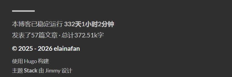
页脚覆盖文件 layouts/partials/footer/footer.html 显示博客运行时间、文章数量与总字数。
运行时间的 HTML 结构如下:
1
2
3
4
| <section class="running-time">
本博客已稳定运行
<span id="runningdays" class="running-days"></span>
</section>
|
layouts/partials/footer/custom.html 使用配置的起始日期计算天、小时和分钟:
 1
 2
 3
 4
 5
 6
 7
 8
 9
10
11
12
13
14
| function updateRunningDays() {
let s1 = '2025-01-01';
s1 = new Date(s1.replace(/-/g, "/"));
let s2 = new Date();
let timeDifference = s2.getTime() - s1.getTime();
let days = Math.floor(timeDifference / (1000 * 60 * 60 * 24));
let hours = Math.floor((timeDifference % (1000 * 60 * 60 * 24)) / (1000 * 60 * 60));
let minutes = Math.floor((timeDifference % (1000 * 60 * 60)) / (1000 * 60));
let result = days + "天" + hours + "小时" + minutes + "分钟";
const elem = document.getElementById('runningdays');
if (elem) elem.innerHTML = result;
}
|
文章数与字数
文章数与总字数由 layouts/partials/footer/footer.html 中的 Hugo 模板计算:
1
2
3
4
5
6
7
8
| {{ $publishedArticles := where .Site.RegularPages "Section" "post" }}
{{ $publishedArticles = where $publishedArticles "Params.hidden" "!=" true }}
{{$scratch := newScratch}}
{{ range (where .Site.Pages "Kind" "page" )}}
{{$scratch.Add "total" .WordCount}}
{{ end }}
发表了{{ len $publishedArticles }}篇文章 ·
总计{{ div ($scratch.Get "total") 1000.0 | lang.FormatNumber 2 }}k字
|
$publishedArticles 只统计 .Site.RegularPages 中公开的 post 页面,并排除 hidden: true 的系列子页。独立功能页位于 page 分区,不进入文章数量。总字数使用全部内容页的字数总和。
对应样式在 assets/scss/partials/footer.scss 中,额外给 .totalcount 和 .running-time 做了颜色、字号和间距调整。
访问量
layouts/partials/article/components/details.html 在文章日期与阅读时间后显示访问量:
1
2
3
4
5
6
| <div id="viewCount">
{{ partial "helper/icon" "eye" }}
<time class="article-time--reading">
<span id="vercount_value_page_pv">loading... </span>次
</time>
</div>
|
模板使用 assets/icons/eye.svg,统计脚本由 layouts/partials/footer/custom.html 引入:
1
| <script defer src="https://cn.vercount.one/js"></script>
|
首页与列表页也会复用文章卡片结构,showHideView 会在非文章页隐藏浏览量。
文章加密
layouts/partials/article/components/content.html 检查 frontmatter 中的 encrypt: true,显示加密入口卡片,并把正文放在隐藏的 #post-content 中:
 1
 2
 3
 4
 5
 6
 7
 8
 9
10
11
12
13
14
15
16
17
18
19
| {{ if .Params.encrypt }}
<div id="encrypt-box" class="encrypt-box" data-lock-state="idle">
<div class="encrypt-box__body">
<h2>加密文章</h2>
<p class="encrypt-box__hint">请输入访问密码。</p>
<div class="encrypt-box__form">
<input type="password" id="pwd" aria-label="访问密码">
<button type="button" onclick="unlockEncryptedPost()">解锁</button>
</div>
<p id="encrypt-message" class="encrypt-box__message" role="status"></p>
</div>
</div>
<div id="post-content" style="display:none;">
{{ .Content | replaceRE "(<table>(?:.|\n)+?</table>)" (printf "<div class=\"table-wrapper\">${1}</div>") | safeHTML }}
</div>
{{ else }}
{{ .Content | safeHTML }}
{{ end }}
|
layouts/partials/footer/custom.html 中的 unlockEncryptedPost 使用 Web Crypto 的 PBKDF2 派生摘要,并与预先写好的摘要比较。匹配成功后显示正文,失败时在卡片内显示错误状态。脚本常驻 footer,PJAX 进入加密文章时也能正常执行。
 1
 2
 3
 4
 5
 6
 7
 8
 9
10
11
12
13
14
15
16
17
18
19
20
21
22
23
24
25
26
27
28
29
30
31
32
33
34
35
36
37
38
39
40
41
42
43
| async function derivePostPassword(password) {
const encoder = new TextEncoder();
const key = await crypto.subtle.importKey(
"raw",
encoder.encode(password),
"PBKDF2",
false,
["deriveBits"]
);
const buffer = await crypto.subtle.deriveBits(
{
name: "PBKDF2",
salt: encoder.encode("站点自定义 salt"),
iterations: 180000,
hash: "SHA-256"
},
key,
256
);
return Array.from(new Uint8Array(buffer))
.map(byte => byte.toString(16).padStart(2, "0"))
.join("");
}
window.unlockEncryptedPost = async function () {
const pwd = document.getElementById("pwd").value;
const box = document.getElementById("encrypt-box");
const content = document.getElementById("post-content");
const digest = await derivePostPassword(pwd);
if (digest === "预先计算好的 PBKDF2 摘要") {
box.style.display = "none";
content.style.display = "block";
} else {
box.classList.add("encrypt-box--error");
}
};
document.addEventListener("keydown", e => {
if (e.key === "Enter" && document.getElementById("pwd")) {
window.unlockEncryptedPost();
}
});
|
解锁卡片与错误状态样式位于 assets/scss/custom/_article-extras.scss。这套方案属于静态站阅读门禁,生成的 HTML 仍包含正文;RSS 与搜索模板会过滤加密内容,脚本中只保存 PBKDF2 摘要,不保存明文密码。
表格
layouts/partials/article/components/content.html 为表格增加滚动容器:
1
| {{ .Content | replaceRE "(<table>(?:.|\n)+?</table>)" (printf "<div class=\"table-wrapper\">${1}</div>") | safeHTML }}
|
文章中的 <table> 会自动包进 .table-wrapper,宽表格可以在窄屏幕上横向滚动。

搜索过滤
搜索页面的模板是 layouts/page/search.html,搜索数据由 layouts/page/search.json 生成。
layouts/page/search.json 使用下面的页面过滤:
1
2
3
| {{- $pages := where .Site.RegularPages "Type" "in" .Site.Params.mainSections -}}
{{- $notHidden := where .Site.RegularPages "Params.hidden" "!=" true -}}
{{- $filtered := ($pages | intersect $notHidden) -}}
|
搜索只收录 post 主分区中的公开文章,并过滤 hidden: true 页面。1400.md、1600.md 等长期系列子页不会单独出现在结果中。
前端搜索逻辑位于 assets/ts/search.tsx。脚本读取搜索 JSON,把标题和正文转成纯文本,再根据关键词生成带 <mark> 的预览片段;初始化函数由 Stack.init() 调用,以适配 PJAX 页面切换。
外链
layouts/_default/_markup/render-link.html 控制外链打开方式:
1
2
3
| <a class="link" href="{{ .Destination | safeURL }}" {{ with .Title}} title="{{ . }}"
{{ end }}{{ if strings.HasPrefix .Destination "http" }} target="_blank" rel="noopener"
{{ end }}>{{ .Text | safeHTML }}</a>
|
.Destination 以 http 开头时,链接会获得 target="_blank" 与 rel="noopener",并在新标签页打开。
图标
自定义图标位于 assets/icons,例如 bilibili.svg、photo.svg、eye.svg、left.svg 与 right.svg。Stack 通过 partial "helper/icon" 读取该目录中的图标。
图库页 content/page/photo/index.md 的 frontmatter 使用:
1
2
3
4
5
| menu:
main:
weight: -50
params:
icon: photo
|
Hugo 渲染菜单时会读取 assets/icons/photo.svg。
图库
图库页使用 layouts/photo/single.html,图片资源位于 assets/waifus。模板通过下面的表达式收集图片:
1
| {{- $imgs := resources.Match "waifus/*.{jpg,jpeg,png,webp}" -}}
|
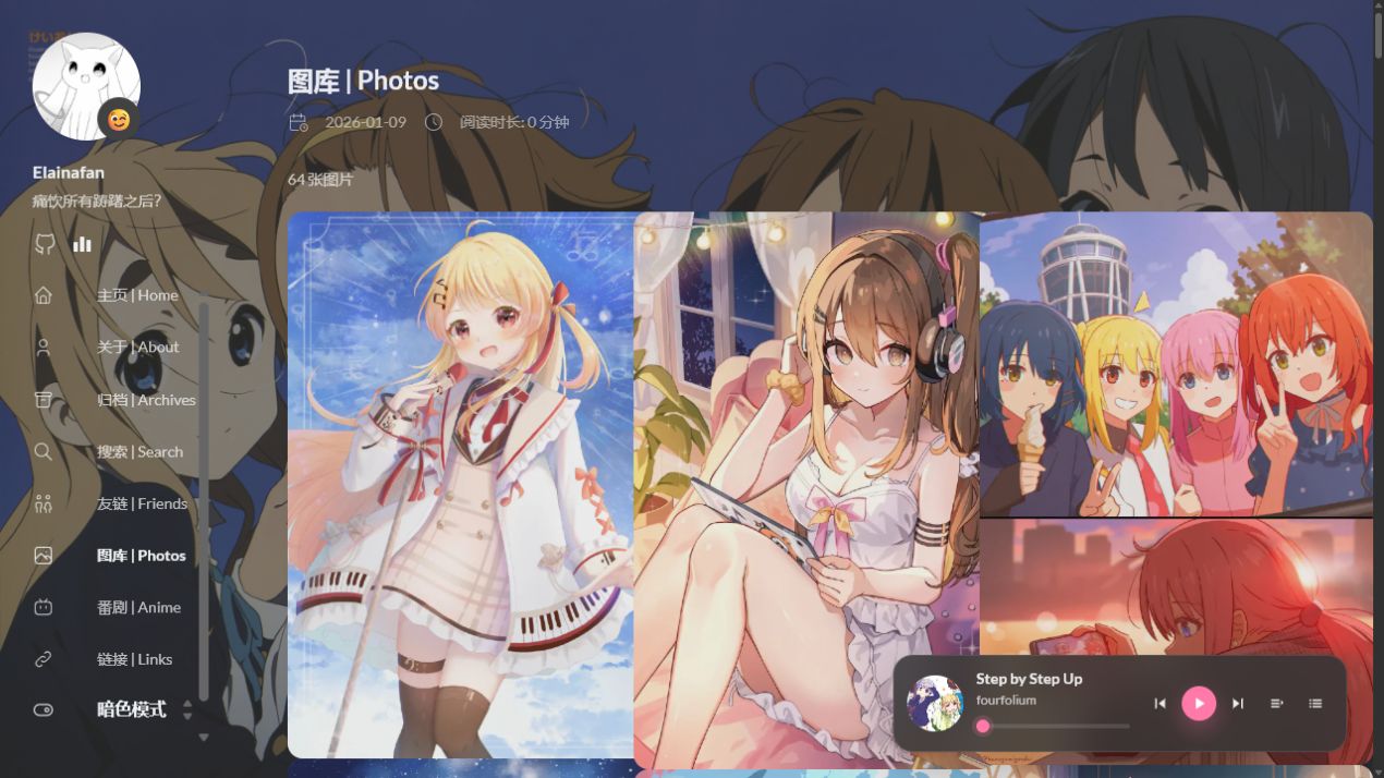
photo-toolbar 显示图片数量,下面是三列瀑布流。每张图使用 Hugo 的 Fit 生成缩略图,a 标签指向原图:
 1
 2
 3
 4
 5
 6
 7
 8
 9
10
11
12
13
14
| {{- range $i, $img := $imgs -}}
{{- $thumb := $img.Fit "640x900 q82" -}}
<figure class="gallery-image photo-tile">
<a href="{{ $img.RelPermalink }}" target="_blank" rel="noopener">
<img
src="{{ $thumb.RelPermalink }}"
data-thumb="{{ $thumb.RelPermalink }}"
width="{{ $img.Width }}"
height="{{ $img.Height }}"
loading="lazy"
alt="图库图片 {{ add $i 1 }}">
</a>
</figure>
{{- end -}}
|
首屏只加载缩略图,PhotoSwipe 点击后读取原图。assets/ts/gallery.ts 在打开图片前优先读取链接地址:
1
2
3
| const link = item.el.querySelector('a');
item.src = link?.href || img.src;
item.msrc = img.getAttribute('data-thumb') || img.src;
|
瀑布流样式位于 layouts/photo/single.html。桌面端三列,中等宽度两列,手机端一列,图片保持原比例:
 1
 2
 3
 4
 5
 6
 7
 8
 9
10
11
12
13
14
15
16
17
| .photo-gallery-content .gallery.photo-masonry {
display: block;
column-count: 3;
column-gap: 16px;
}
@media (max-width: 900px) {
.photo-gallery-content .gallery.photo-masonry {
column-count: 2;
}
}
@media (max-width: 520px) {
.photo-gallery-content .gallery.photo-masonry {
column-count: 1;
}
}
|